Color Triggers Emotional Responses During Gameplay
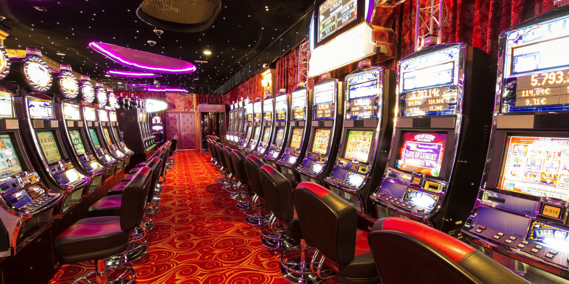
Color is one of the first elements a player notices when launching an online slot machine. It shapes emotional responses before the first spin even begins. Designers use specific color palettes to evoke excitement, calm, urgency, or focus—depending on the gameplay experience they want to create.
When a player enters a slot game, bold and vibrant colors increase alertness. Bright reds, intense oranges, and glowing yellows activate the brain’s reward systems. Cooler tones like blue and green provide a steadier, more relaxed environment. Each color creates a subtle emotional shift that affects how long players stay and how they respond to wins and losses.
Warm Tones Drive Fast-Paced Play
Online slot games often use warm tones—like red, orange, and gold—to push fast, energetic gameplay. These colors stimulate the brain and increase visual focus. They encourage players to act quickly, stay alert, and continue spinning.
A player encountering a red-highlighted spin button or gold bonus animation processes those signals faster. These color choices drive urgency and reinforce the idea that rewards are within reach. When used strategically, warm tones increase momentum and extend the time a player stays engaged in a session.
Cool Colors Promote Prolonged Focus
In contrast, cool tones such as blue, teal, and green are used to slow the pace and promote longer sessions. These shades calm the mind and reduce visual fatigue. Designers use cool colors when they want players to settle into a rhythm and continue playing over time.
As the player navigates a game with cooler tones, the environment feels more stable. The interface looks smooth and predictable. This leads to deeper focus and steadier interaction. The use of calming colors doesn’t decrease engagement—it just redirects the player’s energy from fast clicks to sustained attention.
Color Contrast Highlights Game Features
Color contrast helps players navigate the interface and notice important features. Designers use opposing colors to draw attention to the spin button, bonus triggers, jackpot counters, and win notifications. Without this contrast, players may miss key opportunities or feel lost in the layout.
A player focused on spinning might suddenly notice a flashing element with high contrast. This cue directs attention where the designer wants it. Effective use of contrast ensures players don’t overlook rewards or bonus activations. It also helps reduce confusion during longer sessions by clearly separating background elements from active zones.
Color Cycling Creates the Illusion of Motion
Slot machines rely heavily on motion to hold attention. Even when nothing is spinning, subtle animations and color shifts make the screen feel alive. One common tactic is color cycling—where colors pulse, fade, or rotate in a loop to simulate movement.
A player sees color gradients shifting behind a jackpot meter or lighting effects around reels. These color changes keep the eye moving, preventing mental fatigue. The illusion of motion keeps the game environment dynamic and increases immersion, even between spins. Color cycling acts as a non-intrusive way to maintain visual interest.
Red Is Linked to Urgency and Risk
Red appears frequently in online slot design because of its psychological connection to urgency, risk, and potential reward. Designers often use red during countdowns, final spins, or near-miss scenarios. It signals that something important is happening and pushes players to stay alert.
As a player approaches the final spin of a bonus round, the interface may shift to red tones. This change intensifies the emotional state, increasing the stakes of the moment. Red’s effect on the brain keeps the player’s attention locked in and reinforces the feeling that the outcome could change everything.
Gold and Yellow Reinforce Perceived Value
Gold and yellow are often used to highlight coins, jackpots, and rewards. These colors carry associations with wealth, success, and good fortune. Their use increases the perceived value of in-game payouts—even if the amounts are modest.
When a player sees golden sparkles after a win or yellow flashes around a payout amount, the brain registers that event as more meaningful. These tones turn simple numbers into emotional moments. The association between color and value makes rewards feel bigger and more satisfying, encouraging continued play.
Blue Balances Emotion After High-Stakes Moments
After an intense spin or bonus round, designers often transition the screen to cooler blues or purples. This signals the end of the excitement and allows the player to emotionally reset. Blue tones act as a visual pause, helping players regain focus without disengaging entirely.
A player finishes a bonus round and watches the screen fade into calm blues with gentle animations. The shift tells the brain that the peak moment has passed, but the game continues. This balance of excitement and calm creates a cycle of rising and falling intensity that mirrors how players process wins and losses.
Bright Colors Drive Visual Fatigue Over Time
While bold, bright colors grab attention, too much brightness can cause fatigue during long sessions. Designers must find the right balance. If a screen stays too saturated for too long, players may begin to feel overwhelmed or visually tired.
During extended play, a player starts to feel strained by blinking lights and heavy saturation. The experience becomes less enjoyable, even if the gameplay remains engaging. Games that manage brightness carefully help players stay comfortable and focused. Soft backgrounds, muted accents, and timed color effects improve long-term playability.
Color Consistency Builds Game Identity
A well-designed color scheme helps players remember a specific game. Consistent use of primary and accent colors across all screens builds recognition and trust. When a player returns to a game they’ve played before, the familiar color palette acts as a visual anchor.
A returning player launches the same slot and instantly recognizes its purple and gold theme. The familiarity creates comfort and reduces the mental effort needed to re-engage. Color consistency builds brand identity, encourages repeat play, and strengthens the emotional connection between player and game.
Color Design Directly Shapes Player Behavior
Color is not just an artistic choice—it is a core part of how online slot games influence player experience. Every hue, gradient, and contrast plays a role in directing focus, managing emotion, and reinforcing value.
From warm reds that raise tension to cool blues that restore balance, color affects how players feel, react, and remember. Games that use color with intention create deeper immersion, longer sessions, and stronger engagement. In slot design, visual psychology isn’t hidden—it’s coded into every color on the screen.